Herb Aach: Color Theory
 & collect
from Noel Frackman in review of Precession of the Equinoxes at Martha Jackson Gallery, New York, in Arts Magazine, Sept. 1974, p.74.
Herb Aach (1923–1985) was an American painter and writer. Aach´s painting style is known for its intense and well placed pigmentation, which stemmed from his deep interest in color theory and color relationships. Herb Aach was born in Cologne, Germany in 1923. He studied under German expressionist painter Ludwig Meidner. Nazi persecution caused his family to flee, and in 1938 he arrived in New York City. In 1942 he enlisted in the United States Army and a year later he became a U.S. citizen. After serving during World War II, in Kassel, Germany, he returned to New York in 1946 where he studied under John Ferren and Rufino Tamayo at the Brooklyn Museum Art School. In 1948 he moved, with his new wife, to Mexico City where he continued his fine art studies at Escuela de Pintura y Escultura.
penccil.com/gallery.php?show=9701
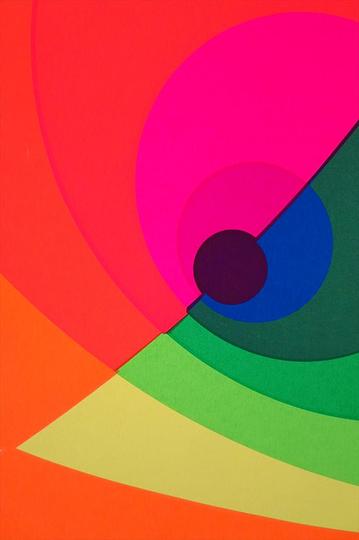
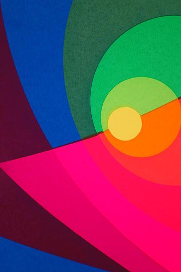
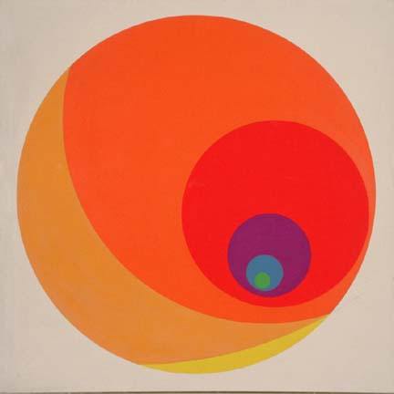
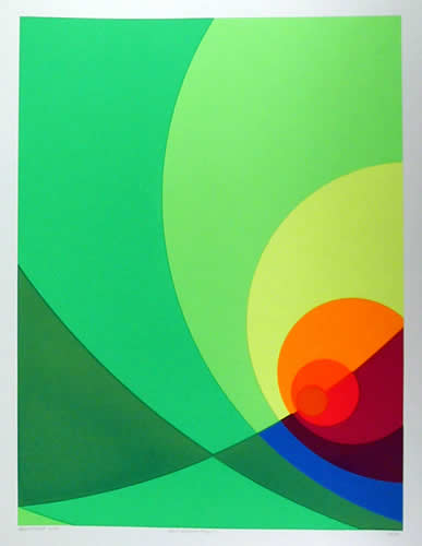
I'm continuing to work in projections and expansions. It seems I can no longer do this by intuition, by rational thought or by analysis. Have to see it all. Trial and error is no longer good enough. Apparently there are no shortcuts. To see this, they must be realized, executed. This has become evident to me through a series of color sketches, Number 1540. Circular projections and expansions in the round. I thought I'd covered maximum variability only to find when I worked to a larger surface I'd omitted at least 50% of potential. Seems there's no end to this vein. In this, I'm probably akin to Albers, though his speculations are too thin for me.
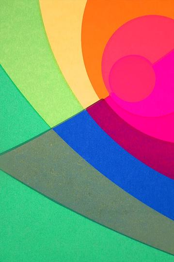
I've moved into the realm of what I call 'impersonal' color. 'Objective' is probably more fitting than 'impersonal'. But 'objective" is so often juxtaposed with that term 'subjective'-an abhorrent dichotomy that runs headlong into psychological bottlenecks. Probably impossible to preclude that kind of association; if anything the general tendency is to elevate it. Though at best, at least here, it's merely incidental. Perhaps 'nonpersonal' color would be better. That suggests general rather than specific color. To me, Giotto's color was 'nonpersonal' (at the Arena Chapel and Santa Coce). Really no taste canon. Dry, matter-of-fact, but not local.
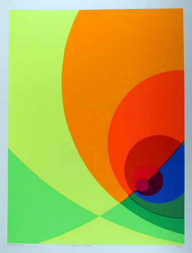
Here's another observation that I can't as yet explain. The first five hues, from the greenish/yellow through orange, seem to make a more 'complete?!' color statement than do the seven. This is hard to see now. Eye accommodation? Are certain laws operational? Limitations in regard to the general effectiveness or perception ranges when using analogous progressions? Or does it now appear incomplete, an insufficient span? Is it related to cone perception, say how many key in? I sure as hell don't know.
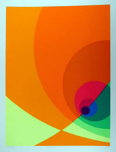
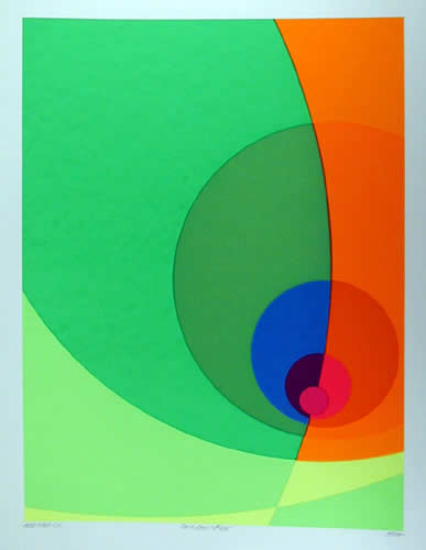
I used 7 hues in Number 1540, going from a small pale greenish/yellow to yellow, yellow/orange, orange/yellow, orange, red/orange then to red-dark, large. Working from light to dark, the bending slightly bunched together and spreading out with larger steps. In other words acceleration toward the periphery. Still using fluorescent pigments, their strength is still significant to me. I'd hoped for relative equal intensity. No such luck. The orange/yellow is weak and I had to introduce white to raise its value. Too close to the orange, otherwise. Also too red, I had to add yellow. Wherever these pigments are not close enough hue-wise they break too far in intermixing and diminish intensity. Normally, compared to conventional pigments, this orange/yellow would really be high. Here it almost acts like a warm yellow ochre. Spatially, it takes away from the across surface motion. Of course, this is less than desirable, penetrating when least desirable. Still operative though. The painting forces the viewer out of a preconceived path by acting nearly as an eccentric top. I seem to be working on the very act of perceiving. I simply must learn to understand pigment limitations and avoid them. Can't bunch together on the warm yellows.
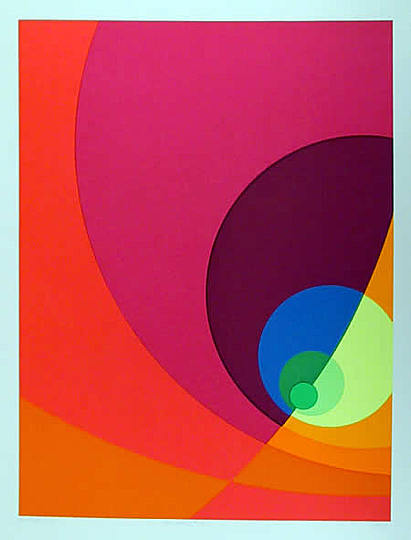
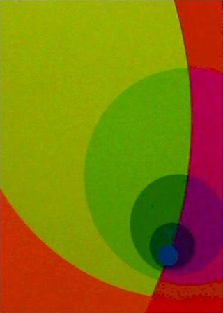
Another thing I don't understand. Of course, my whole series of equal middle value paintings suffered here and there from loss of intensity and therefore spatial disruption. I find for my eyes that higher intensity in bright light tends to mislead the reading as a darker value. I'll be damned that when these paintings are read in dim light, dawn or dusk, the more intense areas do indeed appear darker. Somewhere this is related to the use of white. In other words, to lighten darker pigments requires white as addition. So do they reflect more light in dim light? Is it ultra violet absorbtion or reflection? Or is less light reflected? The light absorbed when less white pigment is present. After all is said and done, Number 1540, based on drawing 17R is a knocker.

Inspirations.
Damien Coupeté images
paintings
German Painting after the 1960s
What is so 'German' about the art made by German painters and sculptors after the 1960s to now? The ...
Sadamitsu Neil Fujita
Sadamitsu Fujita was born in Waimea, Hawaii to Japanese immigrants. He attended boarding school in H...
Stan Galli
Illustrator Stan Galli (1912 - 2009) attended the California School of Fine Arts and was recruited a...
Spacecraft
Raised in Maryland, Nicholas Alan Cope moved to Los Angeles in 2004 and attended Art Center College ...
Mirrors
Jeannette Montgomery Barron was born in 1956 in Atlanta and studied at the International Center of P...
The Way Of The Light
Vasa Mihich studied at the Academy of Applied Arts, University of Belgrade, Yugoslavia. Mihich has l...
Radebaugh and Bohn
Arthur C. Radebaugh (1906-1974) was an American illustrator, airbrush artist, and designer. Some of...
Silent Geography
Silent Geography is a site-specific installation consisting of Hazard's torn paper constructed lands...
The Slave Ship
But, I think, the noblest sea that Turner has ever painted, and, if so, the noblest certainly ever p...
The Sea by Emil Nolde
Born in the village of Nolde in 1902, Emil Hansen came from a family of peasants. Nolde completed an...
John James Audubon and the Golden Eagle
R Kikuo Johnson grew up on the island of Maui. He began a career in cartooning and illustration wit...
Forward Retreat
Mark Tansey was born in California. He attended art classes at the San Francisco Art Institute and s...
Afflicted Objects
"When I was 22 years old I found myself pacing the hallucinogenic black & white sidewalks of Rio de ...
Versuchsaufbau A
Die Grundidee des Versuchsaufbaus–A beruht auf dem System der astronomischen Sonnenuhr. Sonnenuhre...
Pavel Tchelitchew: Spiral head
Pavel Tchelitchew (Па́вел Фёдорович Чели́щев) (1898 - 1957) was a surrealist ...
Ramona Rosales Portraits
Photographer Ramona Rosales lives and works in Los Angeles.
Low Tech
Kevin Twomey´s first study of light came from studying theatrical lighting where he learned the abi...
Fernando Botero
Who doesn´t like Botero? Colombian painter and sculptor Fernando Botero (born 1932 in Medellín) is...
Crystal Palace
Etchings by Alexander Brodsky & Ilya Utkin, Russia. Alexander Brodsky was one of the founders of the...
New York by Louis Faurer
Louis Faurer (1916 – 2001) was an American fashion and street photographer. The significance of h...
Things As They Are
Erin O´Keefe is a visual artist and architect based in New York City and New Brunswick, Canada. She...
Sebastian Stoskopff the Painter of Vessels
Sebastian (or Sébastien) Stoskopff (Strasbourg, July 13, 1597 – Idstein February 10, 1657) was an...
Pryor Console
The CASTE line of furniture and accessories is designed by Ty Best. Ty was born and raised in Montan...
Jean Arp: Randomness
Randomness was a key part of Jean Arp’s work right from the creation of the first dadaist group in...
Heaven & Hell
Details from paintings by Hieronymus Bosch.
Hell & Heaven
John Martin was born near Hexham, Northumberland. He was apprenticed first to an heraldic coach pain...
Postcards from Miami
Art Deco in Miami Beach. Photos (C) Mario Gagliardi
The Art of Ralph McQarrie
Ralph Angus McQuarrie studied at the Art Center School in Pasadena. He first worked for a dentistry ...
Ben Weiner: Post-Psychedelic Dreams
Ben Weiner lives and works in Queens, New York.
Printed Lamps
3D printed Hanging lamps by Studio Meraldi and Rubini. Matteo Meraldi and Marco Rubini met in 2009 a...
Print A Chair
Loop chair by Markus Johannson: The final purpose of this project was to gain more knowledge about f...
Icons of American Design: George Nelson
"Good design, like good painting, cooking, architecture or whatever you like, is a manifestation of ...
More cats in art
Cats throughout the centuries.
Deutschland
Design of painted wall texts by Rasmus Koch studio for artist Jens Haaning. In 2004, Jens Haaning wr...
Foam wood chair
We looked at ways of incorporating waste shavings into design using bio-resin. A curious chemical re...
Foam wood table
The wood has been planed down to its constituent wood particles and has been recast. As the wood sta...
Supercenter disruptions
Mass: an installation project about creating visual disruptions in places of mass. Mass is a site sp...
Heinrich Hoerle, Franz Wilhelm Seiwert and Anton Raederscheidt
Paintings by Heinrich Hoerle, born 1895, Franz Wilhelm Seiwert, born 1894, and Anton Räderscheidt, ...
Sisyphus
"Motion Control" is an industry term for computer-controlled movement in applications like robotics ...
Paolo Cirio: Overexposed
This artwork is composed of a series of nine unauthorized photos of high-ranking U.S. intelligence o...
Architectural Fun Ride
Borrowing language from roller coasters, the “Architectural Fun Ride” is a block-long, program-l...
Fresh White
Four major arcana here: Fresh White is at a turning point, and a very positive one. The Sun and the ...
American Modern Paintings at Sotheby´s
Sotheby's New York sale on Wednesday, May 20th totaled $38,301,625 reflecting the continuous health ...
A Mirror Darkly
Nick Ross was born in Scotland in 1986. He studied at Gray´s School of Art in Aberdeen on the Indus...
Modigliani: Your real duty is to save your dream
"What I am searching for is neither the real nor the unreal, but the subconscious, the mystery of wh...
Amir Zaki: Southern California
Amir Zaki is a practicing artist living in Southern California. He received his MFA from UCLA in 199...
Bart de Baets
Graphic designer Bart de Baets graduated in 2003 from the Gerrit Rietveld academy. Bart teaches gra...
Minoru Yamasaki and Jean Baudrillard
Minoru Yamasaki, best known as the architect of the World Trade Center in Manhattan, created several...
Frank Stella: Radical Abstraction
In 1959, a newcomer in his early twenties takes New York’s art scene by storm: the American Frank ...
Shannon Goff
Shannon Goff works with sculpture, ceramics, and drawing. Goff received a BFA from University of Mic...
Gordon Walters: Koru
"My work is an investigation of positive/negative relationships within a deliberately limited range ...
Carlos Cruz-Diez: Chromointerference
"Color is not simply the color of things or the color of form, but an evolving situation, a reality ...
Francisco Sobrino: Geometry, Light and Movement
Francisco Sobrino (1932 – 2014) was one of the great geometric and kinetic artists of the 20th cen...
Structure and Movement: Gerhard von Graevenitz
Gerhard von Graevenitz (1934 - 1983 ) was a German kinetic artist, representative of Op-Art and earl...
Monet and the Birth of Impressionism
The nineteenth century was a time of upheavals. A wide variety of developments took place at the sam...
Stars in your eyes
Tim Lahan is an artist and illustrator living and working in New York. He’s the author of The Nosy...
Paul Rand
A selection of work by eminent American graphic designer Paul Rand.
Mestizio
Mestizio Disenio is a young design studio from Argentina.
Promover nuevos comportamientos culturale...
Islamic Art Now
The Los Angeles County Museum of Art (LACMA) presents Islamic Art Now: Contemporary Art of the Middl...
Constructing the sixties
"My personal practice focuses on America during the 1960s and 1970s. The works take the form of stag...
Biomimicry Soft Seat
BIOMIMICRY: 3D PRINTED SOFT SEAT is the graduation project of Lilian van Daal. The production and as...
And atelier
And atelier is a small, independent design studio founded in 2010 by João Araújo and Rita Huet and...
Ghia Gilda
Chrysler’s executive Virgil Exner commissioned the Gilda showcar in 1955. It was designed by desig...
Richard Estes´ New York
"Estes is a paradigmatic example of a world-class artist who is also a consummate artisan. He uses h...
Dessislava Dobreva Terzieva: Nature vs. Nurture
Collages by Dessislava Dobreva Terzieva, a Bulgarian born, Detroit based artist.
Exit Eden
Doug Fogelson studied photography at The School of the Art Institute of Chicago and Columbia College...
1-Bit Symphony
Tristan Perich studied math, music and computer science at Columbia University, and received a maste...
Trylon and Perisphere
Images from the New York World´s Fair 1939.
The Tallest Buildings in the World
The tallest buildings in the world in 1901 New York City and other images from the United States aro...
also:
Field of Notion
Field of Notion delves into the dichotomies of light and shadows, life and death, creating a series ...
Paintings 2024
An ongoing series of mixed media paintings
CROMOS
Collage
PERSONAJES
Collage
VEOVEO
Painting
PINTAORA
Painting
Coloured stones
The coloured stones is use Traditional Chinese Taihu Stone
The Demonstrations series.
A new series of paintings, oil on canvas, that deal with movement, the power and energy of the crowd...
Curtains
A series of watercolour paintings.
Laurel Hills Residence
A beautiful example of a contemporary Californian residence, designed by Assembledge architects. The...
Los Angeles
Traveling with Google Maps
Pierre Bonnard: The Memory of Colors
In autumn and winter 2019/20 the Bank Austria Kunstforum Wien presented »Pierre Bonnard - The Color...
The e-scooter Boom
The German Ministry of Transport announced that it will legalize e-scooters as road vehicles. All Ge...
I See Violence in Your Eyes (I-VIII)
Pigment, graphite, charcoal, & mixed media on paper.
Pieter Bruegel
During his lifetime, Pieter Bruegel the Elder was already among the period’s most sought-after art...
The Joys of Ice Skating
That skating 400 years ago was one of the most popular winter activities in the Netherlands can be s...
Franz Kline
Around 1950, Franz Kline radically simplified painting: “Instead of making a sign you can read, yo...
Gaetano Pesce: Abstraction is boring
"Abstraction is boring and limited as a mode of expression. Reducing and reducing designs means that...
Jeff Zimmerman
Jeff Zimmermann is a Chicago based artist. Born in Kentucky, Zimmerman spent his childhood among nat...
New Generation
Experiemntal art
The Menu
The food menu as we know it today is an invention of the 19th century. Traditionally, during a meal ...
American Food
Davide Luciano is a New York based conceptual food and beverage photographer and motion artist. His ...
Kippenberger
Martin Kippenberger (born 1953 in Dortmund, died 1997 in Vienna) is one of the foremost and simultan...
“I perhaps owe it to flowers that I became a painter.”
Arguably the most important painter of gardens in the history of art, Monet was also an avid horticu...
Expression/Information
Painting is seen as a form of practice that—contrary to canonical accounts—in no way shies away ...
German Art since 1960
German ‘paragons of painting’ such as Georg Baselitz, Jörg Immendorff and Markus Lüpertz have ...
Brazil Modernism
20th century architecture in Brazil, including work by Lina Bo Bardi, Lúcio Costa, Affonso Reidy, O...
Heartbeat, Heartseat
Heartbeat consists of a massive heart glowing to the rhythm of a strong, deep and low frequency hear...
Swarm fabrication: Kokkugia / Roland Snooks
We have a fascination with the impact of new technologies on architecture and construction. We are f...
This City
This City is an audio-visual piece performed as musical alter-ego Mark Eats. It explores what happen...
Liqen
Liqen was born in 1980, in Vigo, a port and industrial city of Galicia, in Spain. Since very little,...
The Glass House
"This house was Philip Johnson's autobiography—all of his interests were visible, and all of his a...
The Oily Actor
“I had been looking around these ideas of systemic crisis, global financial crisis, which is what ...
Julius Shulman: Visual Drama
"Julius had an eye for visual drama. With modernist buildings, he loved capturing the strong lines s...
Small Buildings
Photographer Eric Tabuchi, born 1959, lives and works in Paris.
Raymundo Colares
Raymundo Colares (1944 in Grão Mogol, Minas Gerais - 1986 in Montes Claros, Minas Gerais) was a Bra...
Tamara
Tamara de Lempicka (1898 – 1980) was a Polish Art Deco painter. She was the most fashionable portr...
Bring the outside in: The houses of Joseph Eichler
“Eichlers,” as they are referred to in California, are midcentury modern tract homes developed b...
Télémaque
Hervé Télémaque naît à Port-au-Prince, le 5 novembre 1937. En 1957, il quitte Haïti pour New Y...
Impressionist Gardens
“Many of Monet’s colleagues shared his passion for gardening and were inspired to paint gardens ...
Still Life Monkeys
The inclusion of a monkey with other still-life elements imitates earlier Flemish still-life painter...
Mass, space, plane and line
"The essence of architecture is the interrelation and interaction of mass, space, plane and line. Th...

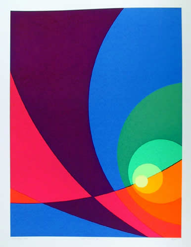
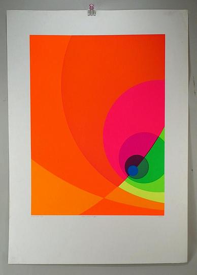
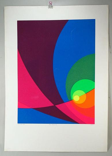
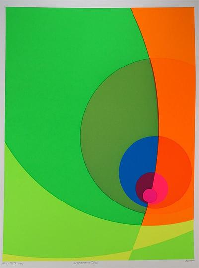
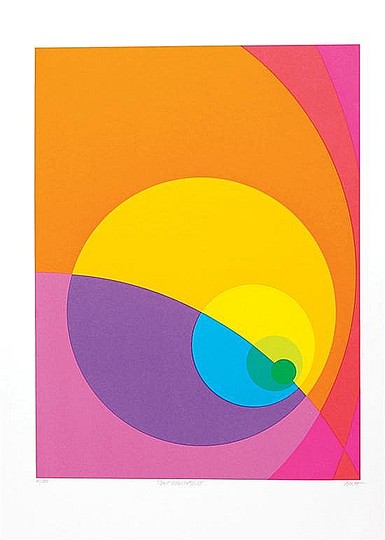
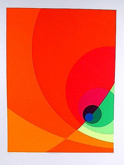
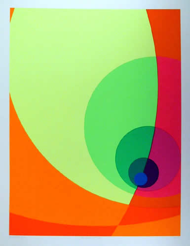
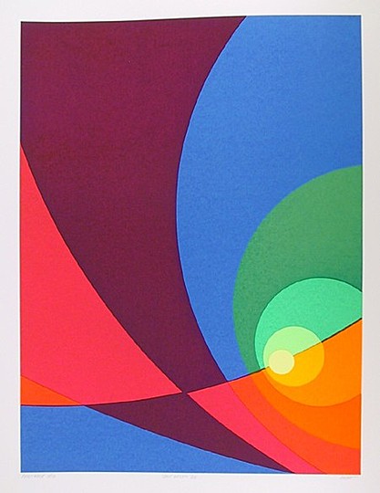
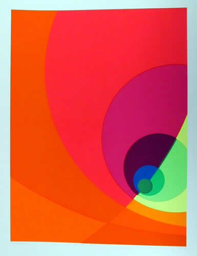
 towards the west, just as the earth itself has a westward drift and an eccentric off-center equinox because of its particular shape. While thoroughly programmed, individually and together, Aach´s paintings do not elicit a computerized response. It is astonishing that they eventually reveal themselves as systems because the viewer is instantly caught up in color activity. Remnants of the artist´s pencil drawings remain at the edges of the paintings, as if to underscore the personal working process that lies behind the programming. As we expect accelerated and intensive color experimentation during the next decade, Aach is indeed a pioneer.
from Noel Frackman in review of Precession of the Equinoxes at Martha Jackson Gallery, New York, in Arts Magazine, Sept. 1974, p.74.
Herb Aach (1923–1985) was an American painter and writer. Aach´s painting style is known for its intense and well placed pigmentation, which stemmed from his deep interest in color theory and color relationships. Herb Aach was born in Cologne, Germany in 1923. He studied under German expressionist painter Ludwig Meidner. Nazi persecution caused his family to flee, and in 1938 he arrived in New York City. In 1942 he enlisted in the United States Army and a year later he became a U.S. citizen. After serving during World War II, in Kassel, Germany, he returned to New York in 1946 where he studied under John Ferren and Rufino Tamayo at the Brooklyn Museum Art School. In 1948 he moved, with his new wife, to Mexico City where he continued his fine art studies at Escuela de Pintura y Escultura.&image=https://www.penccil.com/files/U_31_966643432703_AachSplit_Infinity_4BS.jpg)
 towards the west, just as the earth itself has a westward drift and an eccentric off-center equinox because of its particular shape. While thoroughly programmed, individually and together, Aach´s paintings do not elicit a computerized response. It is astonishing that they eventually reveal themselves as systems because the viewer is instantly caught up in color activity. Remnants of the artist´s pencil drawings remain at the edges of the paintings, as if to underscore the personal working process that lies behind the programming. As we expect accelerated and intensive color experimentation during the next decade, Aach is indeed a pioneer.
from Noel Frackman in review of Precession of the Equinoxes at Martha Jackson Gallery, New York, in Arts Magazine, Sept. 1974, p.74.
Herb Aach (1923–1985) was an American painter and writer. Aach´s painting style is known for its intense and well placed pigmentation, which stemmed from his deep interest in color theory and color relationships. Herb Aach was born in Cologne, Germany in 1923. He studied under German expressionist painter Ludwig Meidner. Nazi persecution caused his family to flee, and in 1938 he arrived in New York City. In 1942 he enlisted in the United States Army and a year later he became a U.S. citizen. After serving during World War II, in Kassel, Germany, he returned to New York in 1946 where he studied under John Ferren and Rufino Tamayo at the Brooklyn Museum Art School. In 1948 he moved, with his new wife, to Mexico City where he continued his fine art studies at Escuela de Pintura y Escultura.&pic=https://www.penccil.com/files/U_31_966643432703_AachSplit_Infinity_4BS.jpg&language=en)